
MacTalk
August 2023
Tracking Air Quality in a Wildfire-Filled World
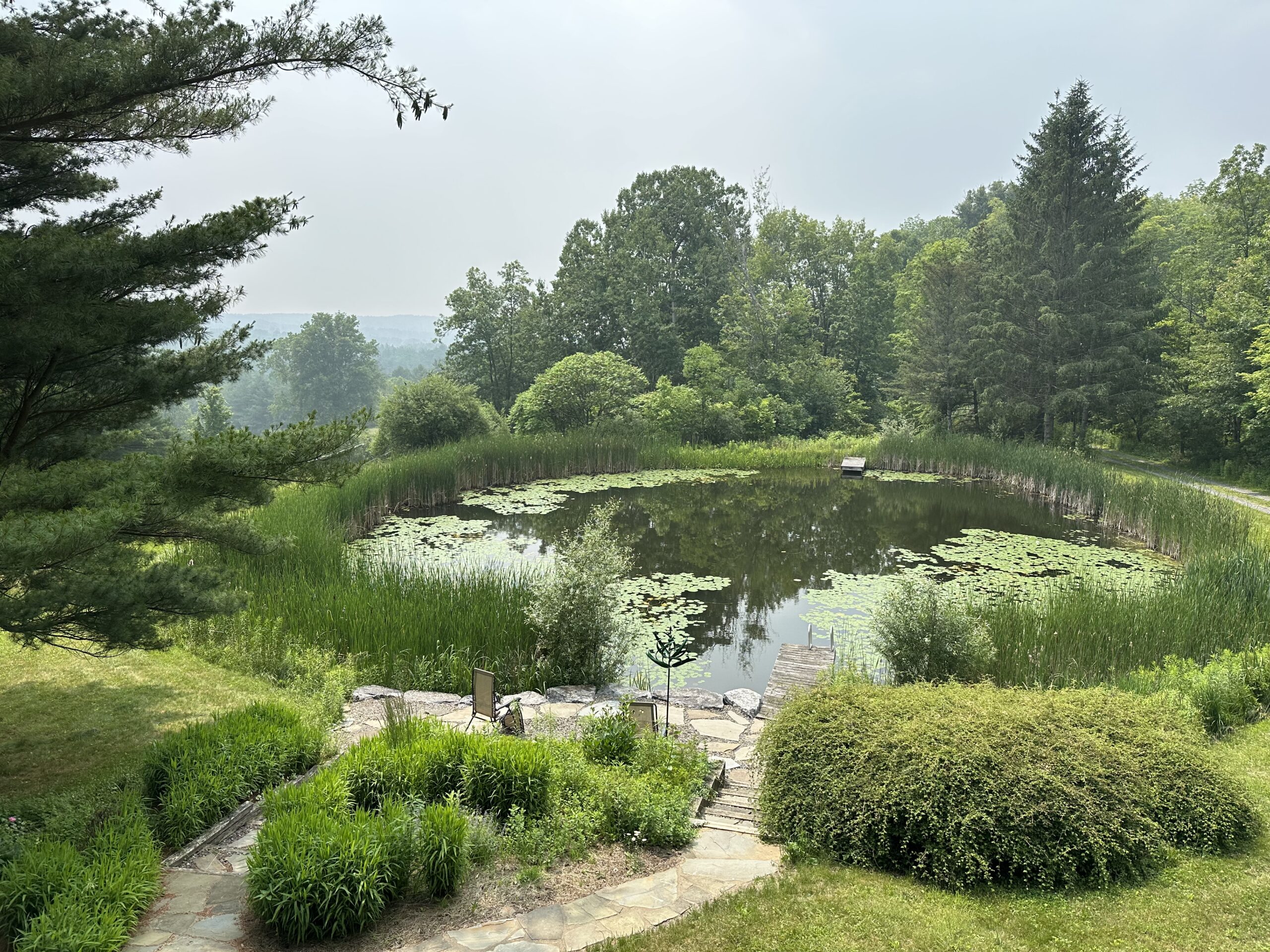
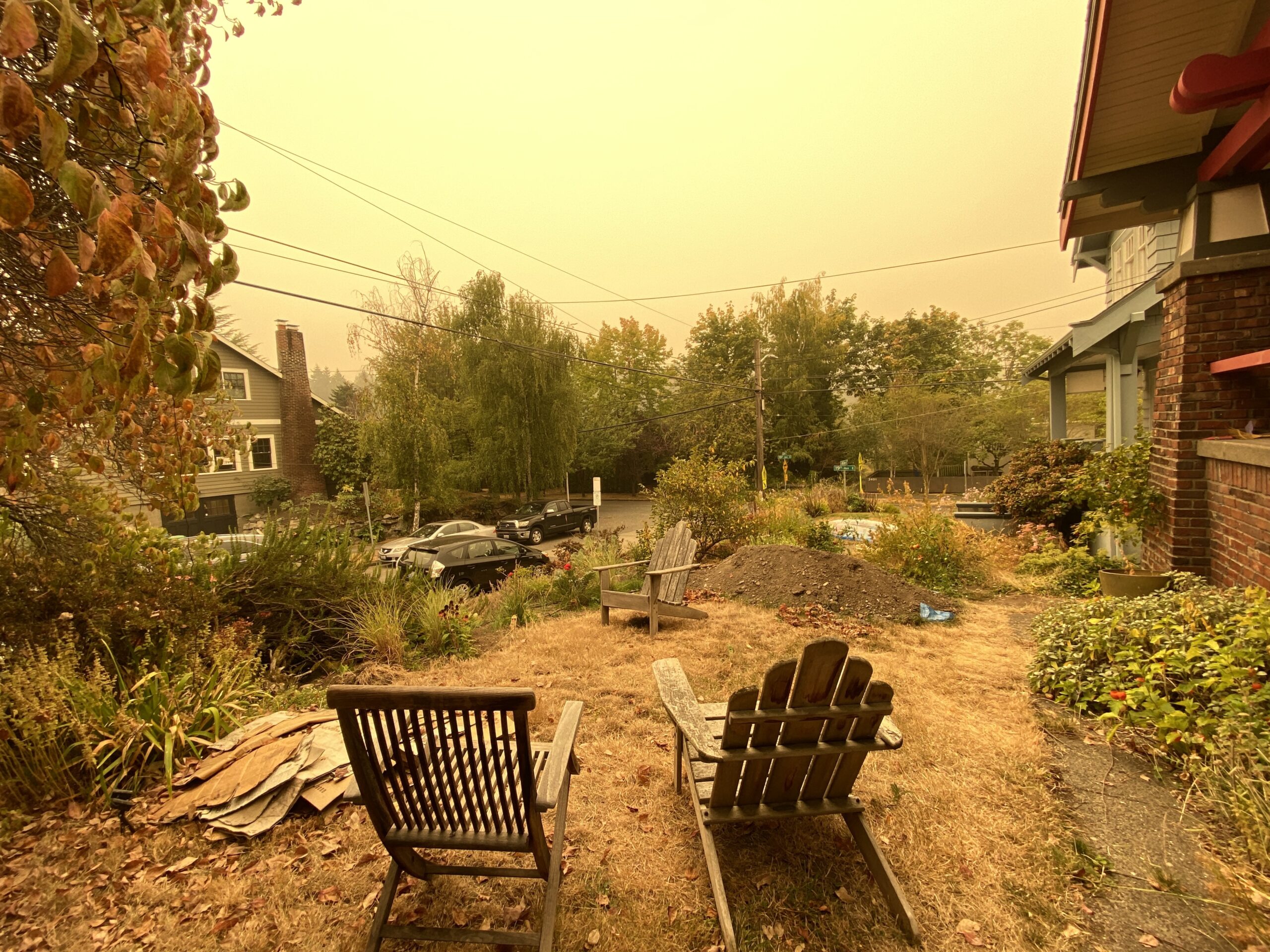
As I look out my office window, the scenery looks… wrong. I live far from any notable sources of pollution in a relatively rural part of upstate New York, and yet the hills just a few miles away are obscured by haze. It doesn’t just look wrong outside, it smells wrong, all thanks to smoke that’s traveled from wildfires far north of me in Canada.
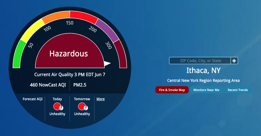
This is our second go-round with wildfire smoke. The first was when it drifted down from the Quebec wildfires about 3 weeks ago. It was terrible that time, with the worst air quality index (AQI) in our area at 460 on a scale of 0 to 500. An AQI is a pollutant measurement that offers a relative risk value—no matter what the scale, being near the top is extremely bad. In this second round of wildfire smoke, the AQI numbers have hovered lower, between 150 and 200, which “only” ranks as “Unhealthy” on the EPA’s scale.
The entire situation is making me jittery and ill at ease, and my reaction to anything unknown is to learn as much as I can and share it with others. You’ve just been nominated to help me keep my cool by letting me write this article.
Wildfires
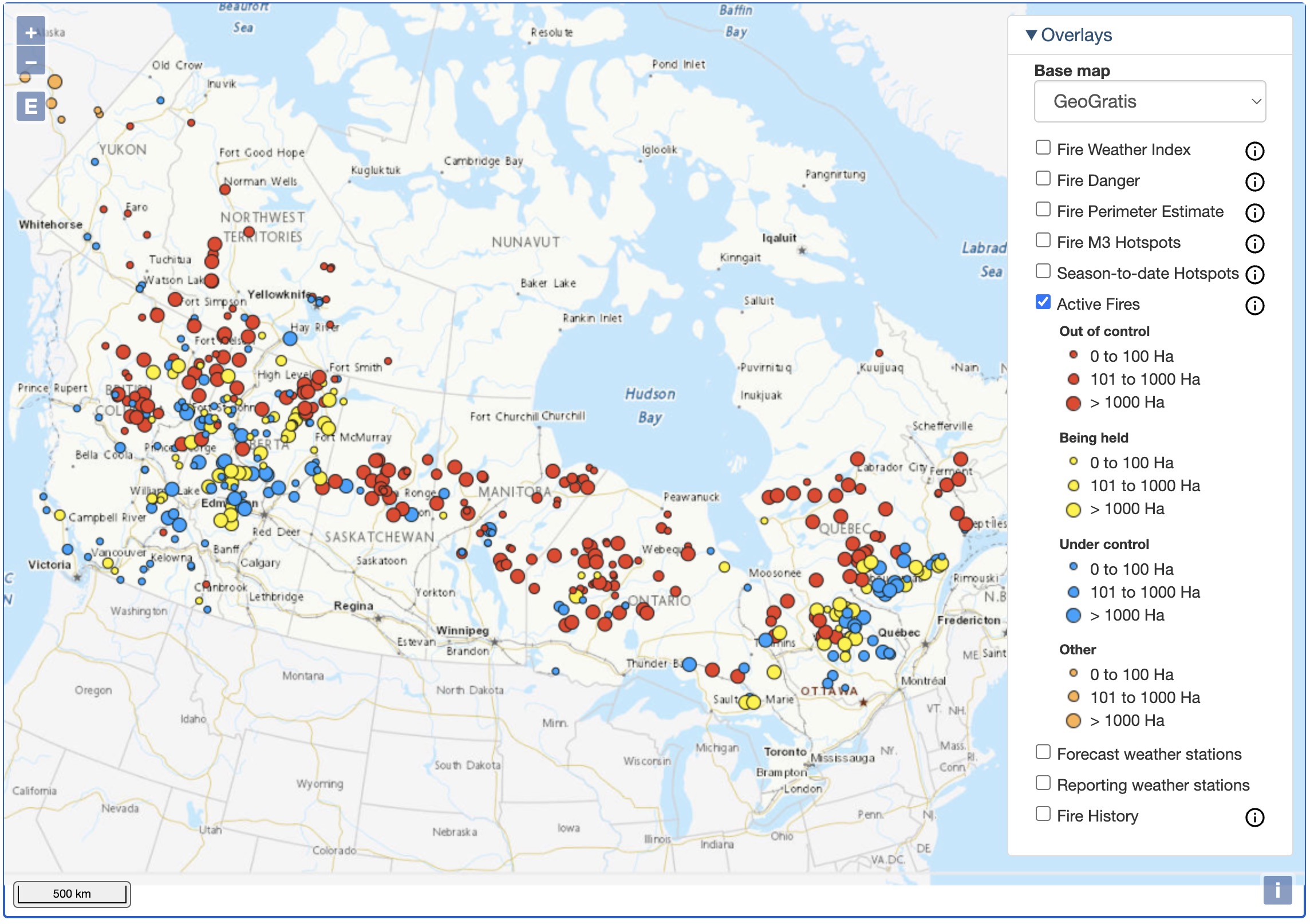
I hope everyone is aware that hundreds of wildfires are burning in Canada, over half of which are considered out of control. This map from the Canadian Wildland Fire Information System gives a sense of the scale of the problem. With over 76,000 square kilometers of land burned this year—nearly 19 million acres, or about the area of Panama—it’s the worst wildfire season in recorded Canadian history, with smoke causing air quality alerts in Canada and the US, along with hazy skies as far away as western Europe. Worse still, it’s early in the typical Canadian wildfire season, and early burns don’t mean fewer later.
Canada and parts of the US have already seen significantly higher-than-normal wildfire burns in the last ten years than in previous decades. Western Canada and all the US western states have experienced some of their worst years in recent times. But 2023 shows that the northern US and most of Canada could also see regular impacts from wildfires for the indefinite future. Lessons learned this year will likely remain relevant going forward.
Climate change is a driver, causing more severe storms mixed with lightning, which causes over half of North American wildfires. Warmer, drier weather exacerbates the problem, and we just experienced a dry spring here in the Northeast.
Worse, wildfires emit vast amounts of carbon and aerosols that can both exacerbate global warming. (Some high-level smoke can reflect sunlight, resulting in a temporary cooling effect like those associated with volcanic eruptions, but that doesn’t outweigh the adverse effects of carbon and aerosols.)
Determining Outdoor Air Quality
Wildfires create smoke from trees and vegetation, of course, but also from building materials and other manufactured products that catch fire. Although the precise chemicals in smoke vary, the primary health concern revolves around particulate matter, specifically particles 2.5 microns or less in width, called PM2.5. They can travel deep into the lungs and cause short-term health effects like eye, nose, throat, and lung irritation, plus coughing, sneezing, runny nose, and shortness of breath. Long-term exposure may be associated with increased rates of chronic bronchitis, reduced lung function, and lung cancer.
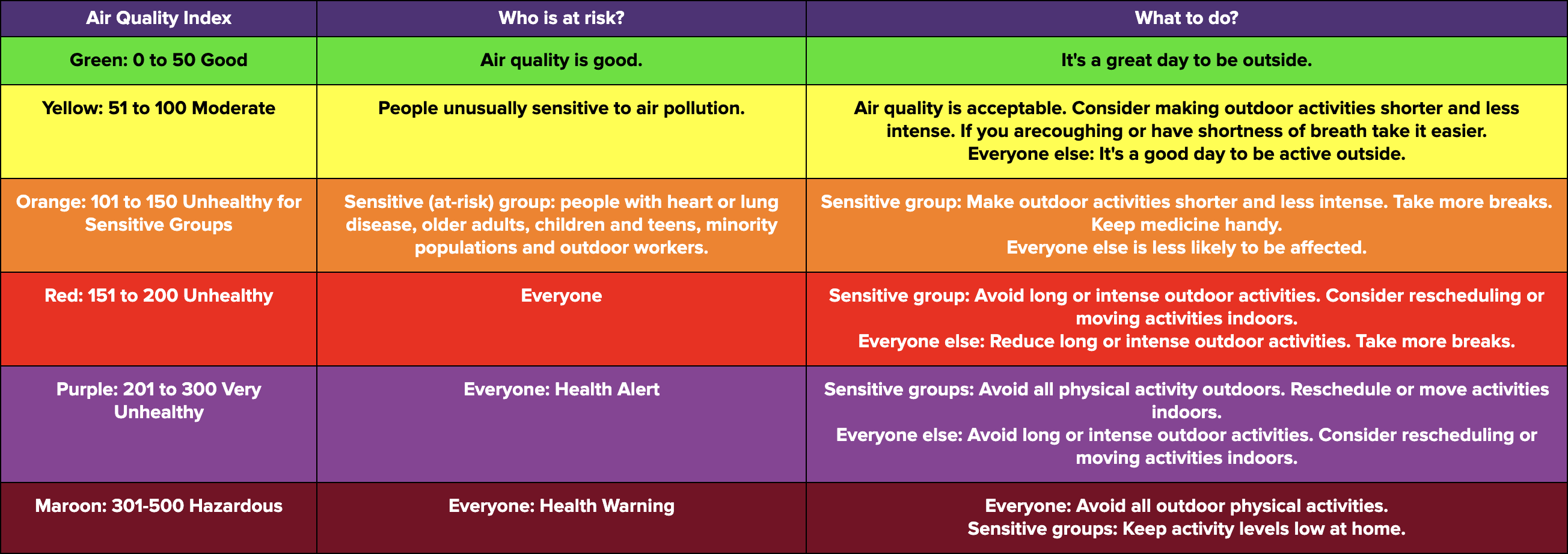
In the US, the Environmental Protection Agency developed the Air Quality Index to track the relative risk of five pollutants: ground-level ozone, particulate matter at two sizes (PM2.5 and PM10), carbon monoxide, sulfur dioxide, and nitrogen dioxide. The two that factor into what the EPA called the NowCast AQI are ozone and particulate matter, but when you see an AQI number, it reflects the primary pollutant at the time, which will be PM2.5 during wildfires. (This explains why you sometimes see sensors on maps with much lower readings than most others; they’re ozone sensors, not particulate sensors.)
The AQI scale in the US ranges from 0 to 500 and is broken into six bands, with information about who is at risk and how people should react to different AQI readings. Perhaps unsurprisingly, other countries have their own scales, so air quality can be difficult to compare with far-flung friends and family.
Here in the US, the central resource for monitoring air quality is the EPA’s AirNow website; an AirNow iPhone app taps into the same data. Along with the NowCast dial and forecast (when conditions are sufficiently stable), the main AirNow page links the Fire & Smoke Map, another map showing nearby official monitors, and a page with recent trends.
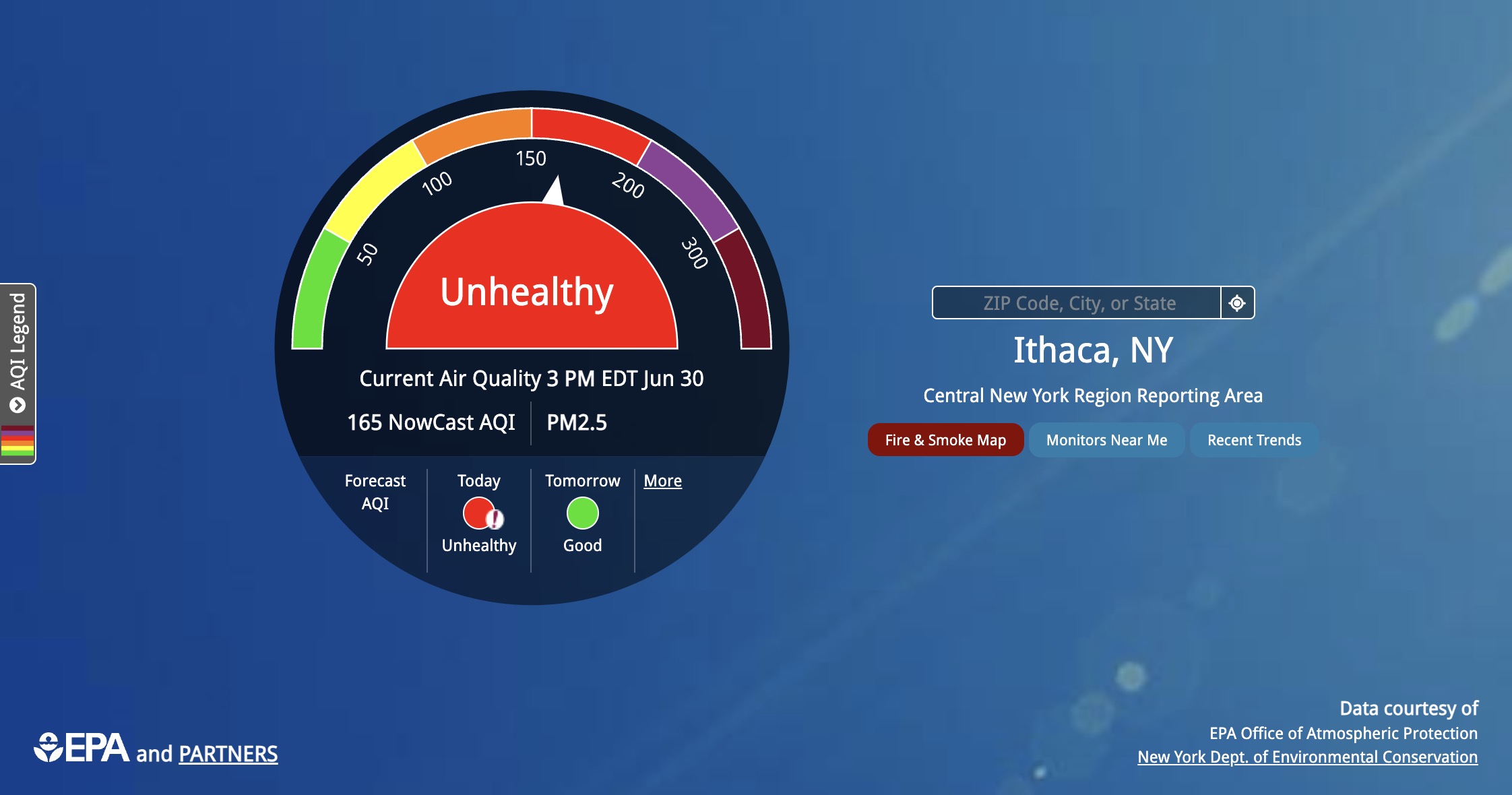
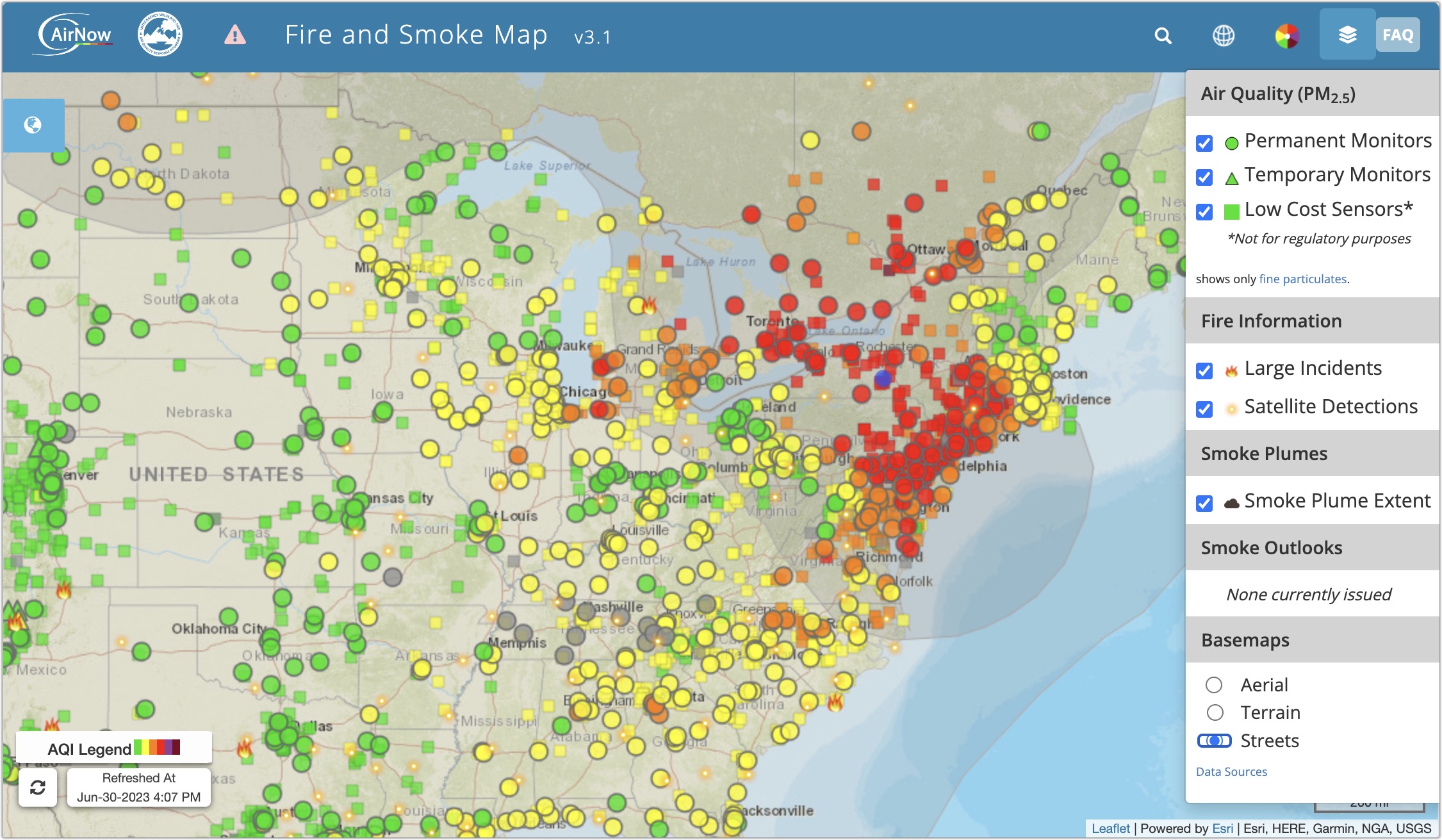
The Fire & Smoke Map is especially helpful because it lets you see where the smoke is and how that relates to the different bands of the AQI. You can zoom and pan to see local detail and click a monitor to see its precise reading. What the map doesn’t do, unfortunately, is animate like we’re used to with weather radar.
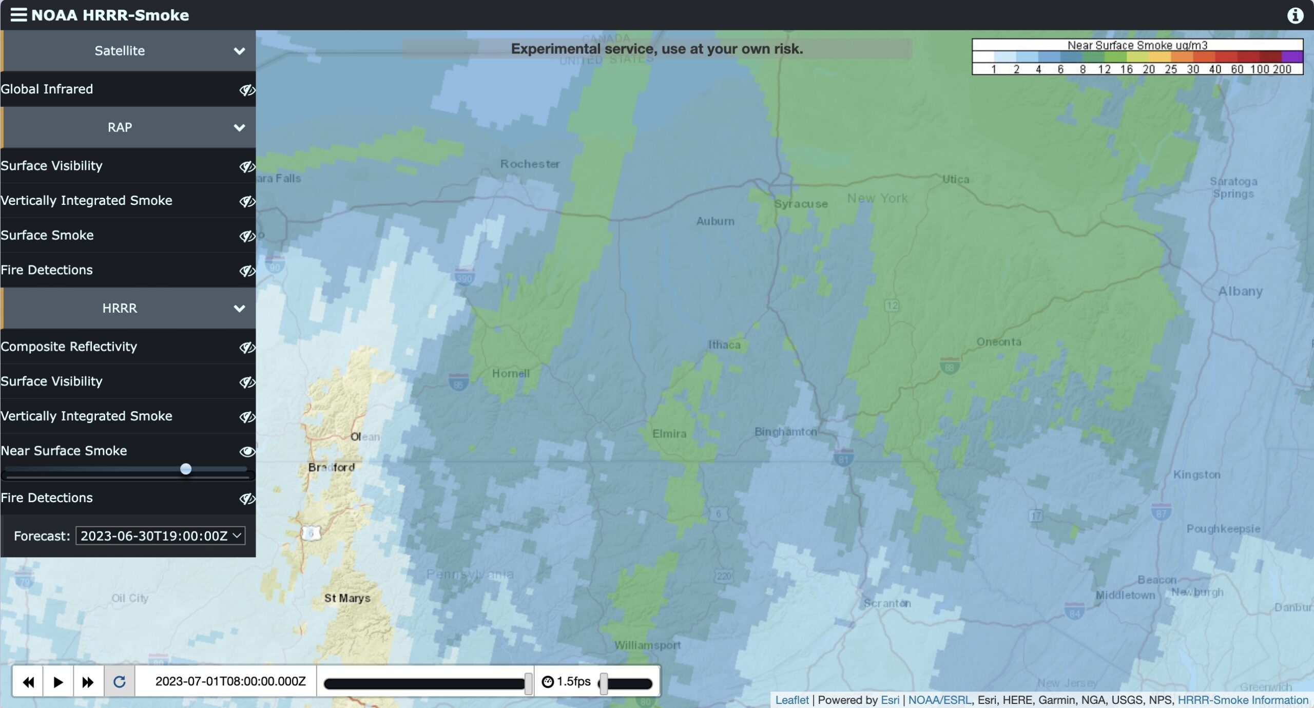
The New York Times created such an animated smoke map, available only via subscription, though some links sent via Messages work, too: I can load it only when I click it from a link Tonya sent me. However, I’ve found a more helpful resource. The National Oceanic and Atmospheric Administration (NOAA) publishes a model called HRRR-Smoke (High-Resolution Rapid Refresh). Its Near Surface Smoke option forecasts how smoke might move in the US in the next 18 hours. Interestingly, it doesn’t attempt to map smoke directly but instead uses infrared to identify fires and then predicts where the smoke will end up based on sophisticated weather models. The RAP model’s Surface Smoke map expands the range to more of North America and might also be useful.
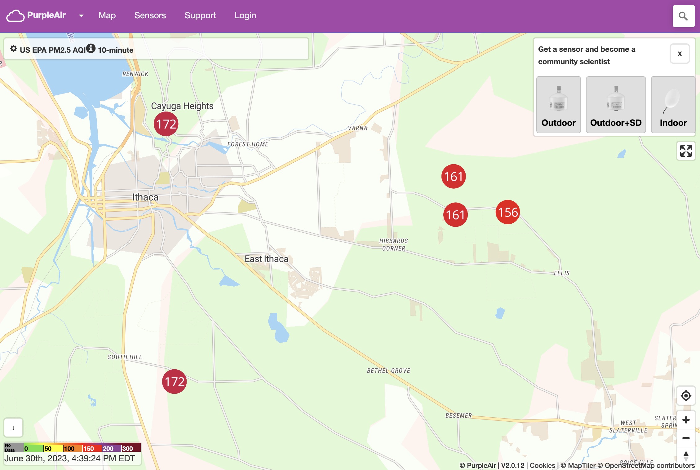
There’s one final map that’s essential. A company called PurpleAir sells inexpensive Internet-connected air quality monitors (under $300) and compiles the collected data on a publicly accessible map. (It works fine on the iPhone, but the Paku app provides a dedicated map view and iPhone and Apple Watch widgets.) As you can see below, there are five sensors in the Ithaca area, and the cluster of three is within half a mile of our house. They’ve been in place for several years because neighbors have been monitoring air quality associated with the natural gas compression station down the road. (The other two appeared this week.) We were particularly grateful for the existence of those three sensors during the first wave of wildfire smoke because the closest official sensor was a government monitoring station 48 miles away. The EPA’s Fire & Smoke Map includes all the PurpleAir monitors, but the PurpleAir map makes it easier to read the numbers at a glance and get a sense of how they might be trending throughout the day.
Evaluating the Data
I found myself checking the iPhone AirNow app so frequently that I decided to add an air quality widget to my iPhone’s Lock screen. Apple’s Weather app and CARROT Weather both provide air quality widgets, but adding them revealed discrepancies between the apps and information provided by different weather service providers. (CARROT Weather Premium users can choose among six weather service providers.) The table shows the AQI reported by different apps and services as of 1 July 2023 at 9 AM.
| App/Service | AQI |
| AirNow app and website | 156 |
| Five nearby PurpleAir monitors, averaged | 140 |
| AccuWeather website | 104 |
| AirCare app | 129 |
| Apple’s Weather app (BreezoMeter) | 137 |
| CARROT using Accuweather | 161 |
| CARROT using AerisWeather | 97 |
| CARROT using Apple Weather | 97 |
| CARROT using Foreca | 161 |
| CARROT using OpenWeather | 97 |
| CARROT using Tomorrow.io | 94 |
| IQAir app | 113 |
| WeatherBug app (BreezoMeter) | 61 |
The discrepancies here troubled me, but I found some explanations, notably in a Medium article by UC Berkeley data scientist Josh Hug. The AirNow AQI is the most official but has two problems:
- It may not be sufficiently local for you. The closest official monitor to me is 48 miles away.
- AirNow’s data is averaged over time. Some sources claim it’s 24 hours, but AirNow says, “The NowCast shows you air quality for the most current hour available by using a calculation that involves multiple hours of past data. The NowCast uses longer averages during periods of stable air quality and shorter averages when air quality is changing rapidly, such as during a wildfire.”
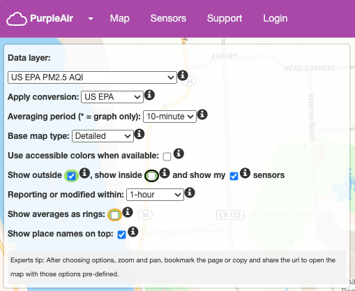
Because of those factors, I’ve been giving more credence to my neighborhood PurpleAir AQI numbers, which are more local and are averaged (by default) over the past 10 minutes. However, it turns out that PurpleAir monitors tend to read higher than AirNow under controlled conditions, so you can enable a correction factor to bring PurpleAir numbers more in line with AirNow readings. Click the line at the top right of the PurpleAir map, and choose US EPA from the Apply Conversion menu. (Because PurpleAir monitors are installed by individuals, they may represent higher or lower levels based on microclimates, but more numbers are generally better.)
AirCare and IQAir claim that their numbers may differ from AirNow due to more monitoring stations and shorter averaging periods (though both say AirNow averages data over 24 hours, which no longer seems to be true). AirCare also says it runs all the data through its unexplained “intelligent algorithm.”
The different weather services in CARROT likely obtain air quality data from the same sources—the Google-owned BreezoMeter for Apple’s Weather and WeatherBug, probably AirNow for AccuWeather and Foreca, and Apple Weather (which used to be Dark Sky) for the rest. I can’t explain the disagreements between Apple’s Weather app and CARROT Weather using the Apple Weather data source, or the AccuWeather website and CARROT’s AccuWeather data source. Given the variability, I can’t recommend relying on any weather app’s AQI numbers.
For now, then, I recommend:
- Basing organizational decisions on the AirNow AQI number because it’s the most official and verifiable
- Adjusting personal behavior based on local PurpleAir monitors
- Checking nearby PurpleAir AQI numbers on the iPhone and Apple Watch using Paku
Determining Indoor Air Quality
What about indoor air quality? Outside air always makes its way into buildings. Many organizations have just spent years trying to increase the amount of fresh air brought in via HVAC systems to reduce the transmission of the SARS-CoV-2 virus. With wildfire smoke pollution, however, outside air becomes problematic without significant filtration—which was part of the recommendation for COVID prevention but not evenly adopted.
We have long had a room-based air purifier with a HEPA (High-Efficiency Particulate Air) filter because Tristan has asthma, and running the air purifier seemed to help his breathing. (Our house relies on in-floor and baseboard radiant heat powered by geothermal, and although we have ducted air handlers for occasional summer air conditioning, they don’t provide significant filtration.) In the fall of 2021, we bought a smaller HEPA-rated air purifier for hotel rooms when we had to make three trips to Connecticut so Tonya could have much-needed back surgery for a herniated disc. But we had no idea how well these filters really worked, especially in the large, open spaces in our house.
Wirecutter isn’t enthusiastic about indoor air quality monitors, but its article misses our desired use case in comparative particulate monitoring. We wanted to get a baseline reading and then run our HEPA air purifiers in different scenarios to see how the numbers changed. Was one air purifier sufficient for our relatively small offices if we closed the doors? How about the main open living space downstairs? Did we have to run the air purifiers on high, which is loud, or would low work well enough?
 We purchased a Temtop M10 Air Quality Monitor for under $100. It arrived too late for the first influx of wildfire smoke, but on this second pass, we’ve used it to determine how well our HEPA air purifiers work. It turns out that the inside AQI will trend toward 100 if left alone (and would presumably equalize with the outside given enough time). Even the smaller air purifier can quickly clear the air in our offices and ensure that our bedroom air is clean enough that we don’t need to listen to it all night. Although the larger air purifier can’t handle the entire downstairs of our house on its own, even on high, when we left both air purifiers running on high overnight, the AQI was in the single digits by morning. All this data has enabled us to tweak our use of air purifiers for optimal air quality and minimal noise.
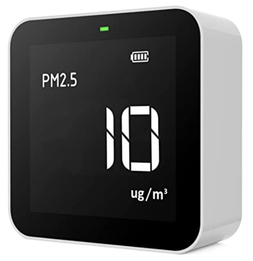
The Temtop M10 is simple. It charges using USB and runs on battery power for quite a few hours before needing another charge. It also works fine plugged in, but we’ve been moving it around the house to test different rooms. A single button toggles power and lets you cycle between readings for particulate matter, AQI, formaldehyde (HCHO), and volatile organic compounds (VOC). You can also set it to cycle automatically between the four screens. We’ve seen no reason to look at anything beyond AQI because we care only about comparative numbers. Wirecutter says its particulate matter sensor is accurate, and in our testing, it’s close to the nearby PurpleAir sensors. It lacks Wi-Fi connectivity and has no app; other Temtop models have such capabilities but cost more.
Editor Glenn Fleishman opted to buy a portable Temtop M2000 with more measurement options (other models are now available) to check air quality in different parts of the house, as his family has a ground floor and daylight basement. The highly portable nature and built-in graphing helped troubleshoot hot spots in the house and unhealthy levels of PM2.5 in the basement. As with my testing, Glenn’s family was able to test air clearing by adjusting fan speed. They also upgraded their duct-based, forced-air HVAC system with a coarser-than-HEPA MERV13-rated filter, which is designed to capture 85% of PM2.5 particles.
Changing Activity Based on Air Quality
The only reason to collect data is if you’re going to change your behavior based on the results. The big question I had early on was how runners should take air quality into account. This wasn’t theoretical—I coach weekly workouts, organize group runs, and help direct races for the Finger Lakes Runners Club. In the first bout with wildfire smoke, I ended up canceling one evening workout and a group run the next day. We were worried about another group run that weekend and a race the following week, but happily, the smoke had moved by then. Nevertheless, we needed some guiding metrics because there’s a difference between an individual choosing to run on their own and the club organizing a formal event during a period of poor air quality.
After some research, I developed the following guidance:
- AQI under 100: Most people need not adjust their workout or racing plans if the AQI is expected to be under 100. Unusually sensitive people with heart or lung disease should take care if the AQI is trending toward 100.
- AQI 100–150: Between 100 and 150, children and other members of sensitive groups (older adults, people with asthma) should avoid running, especially as the number climbs toward 150. Healthy adults can participate if they wish.
- AQI above 150: We would cancel all formal club events and encourage anyone running outside on their own to consider wearing an N95 mask.
The tricky part is the prediction, but between AirNow and the HRRR-Smoke Near Surface Smoke map, it’s possible to get a sense of where the AQI numbers are heading in the next day or so. Even then, it’s guesswork. Yesterday, AirNow was predicting acceptable conditions for today, but the AQI didn’t start to drop until midday, forcing us to cancel a group run this morning.
Lending some credence to this rubric is Tonya’s experience. On the first day we had air quality issues in early June, before we quite realized what was going on, she ran home from Cornell for about an hour. The air didn’t smell of smoke, but looking back at AirNow’s recent trends, the AQI was nearing 100. Two days later, when the AQI was at its worst, she had to go out for a work dinner. While she wore an N95 mask outside and in the car, she said it didn’t seal as well as she’d thought while wearing it for COVID protection, since she could smell smoke through it. Those two exposures gave her classic smoke-inhalation symptoms for the next few days: shortness of breath, tightness in the chest, and itchy eyes. She doesn’t have asthma but is slightly susceptible to breathing issues, so we’ve been taking air quality seriously ever since.
While it can be anxiety-inducing to change behavior in the moment, it’s still relatively easy if you believe it will be only infrequently necessary. Tonya adjusted her schedule so she could work out indoors this past week; my current injury, an MCL sprain in my right knee, has given me an excuse not to stress out about exercising much. But the wildfires in Canada show no signs of abating, which indicates a high likelihood of additional smoke events throughout the summer. Worse, trends suggest that future wildfire seasons may become more common and more extreme. We’ve shown as a society that we can reduce human-generated pollution, but it will be a lot harder to decrease wildfire incidence and spread across vast swaths of remote territory.
Contents

Click for special offers to Mac Users Groups members.

Website design by Blue Heron Web Designs

Click the image for information about advertising on this website.