
MacTalk
November 2021

Charts in Apple’s Numbers Spreadsheet: Which One When?
Apple’s Numbers spreadsheet app offers a wide variety of charts to help interpret the data in its tables (as does its Pages word processor). But when you want to turn numbers into pictures, you need to use the right kind of picture in order to get the information across.
Standard Charts
Everyone’s familiar with the common line, bar, and pie charts, but familiarity doesn’t necessarily lead to understanding which one makes the most sense in a given situation. And what about their offshoots—area charts, stacked bars, and donuts? Pick the wrong one, and your readers might not be able to draw any conclusions or, perhaps worse, could draw the wrong conclusion.
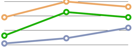
Line Charts
You know what a line chart is; you might even know that its main use is to highlight the rate of change over time, for either a single item or in a comparison of multiple items.
Column and Bar Charts
Use a column (vertical) or bar (horizontal) chart to compare data by group or category: the output of Widget Factories A, B, and C; starting salaries of popular post-grad degree holders; or the monthly average rainfall in your city for each month last year.
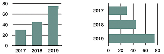
Choosing one of these over the other is usually a practical issue: what fits better on a printed page or Web page, or whether you need to accommodate a long label.
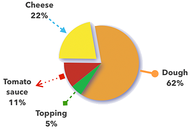
Pie Charts
Pie charts are elegant in their simplicity but are easily misused. We call them pie charts instead of “circular graphs” for a reason: the data represented by the slices makes a whole something. So, use a pie chart when you want to show how a total something is divvied up, not when you’re looking at how a value changes over time. An “exploded” pie chart sounds messy, but it simply has one or more of its slices pulled out for emphasis or general visual effect.
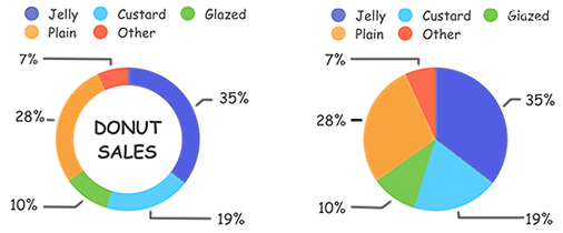
Donut Charts
Like pie charts, donut charts help readers see how a total something is divvied up. There’s controversy as to their efficacy—whether the arcs of a donut chart’s ring are easier or harder to interpret than the wedges of a pie chart. (But then, some experts also disdain the common pie chart on general interpretational principles.)
I think the pie is easier to understand and that you should restrict your use of donut charts to when the differences between arcs are large enough to remain obvious. In this figure, for instance, it’s easier to see the size difference between the orange and dark blue pie wedges than between those colors in the donut ring. Of course, you’d label each wedge/arc with the number it represents, but the mark of a good chart is its ability to convey information visually.
Stacked Column and Bar Charts
A single stacked column or bar is like a (misshapen) pie chart: it lets you see how much of a whole something is divvied up. Using multiple stacked columns or bars in a chart enables you to include information about the overall totals too, signified by the column/bar size, as well as the size of each column/bar’s components. The three charts in this figure show: data for each of three years, a breakdown of the data for those years, and a combination of the information in the first two charts.

You might wonder whether you should present data in a line chart or a column/bar chart. When your goal is to emphasize changes over time, use a line chart; if you want to concentrate on totals at discrete points in time, use a column/bar chart.
Area Charts
An area chart would seem to be simply a line chart that’s filled in with color—and, well, it is. But don’t use it to represent more than one data set unless one set is smaller than the other at all its points. Consider the problem with just two data sets, as shown in the figure below. The background data set is obscured for all except its first and last years. The background data could be nearly the same, but just a little lower at all its points, or it could be drastically different at some or all points. The only clue offered, based on the slope we can see, is that there was a gradual rise from the penultimate to the final number.
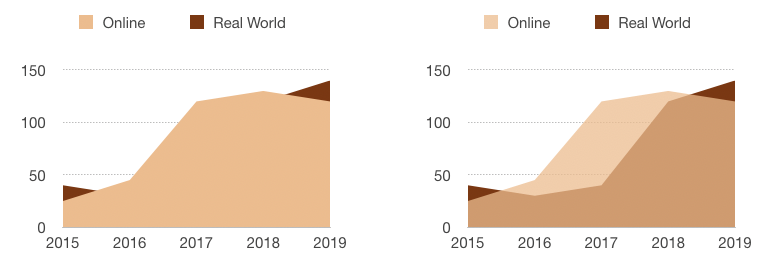
In addition, area charts with multiple data sets often give the wrong impression. You see much more of the frontmost set, so even if at all points it’s smaller than the background set, a quick visual takeaway can be that its data set is the larger one.
Advanced Charts
You might not be as familiar with these lesser-known chart types; they’re used much less frequently. That could be because they’re more prone to being misunderstood by viewers—as well as some creators.
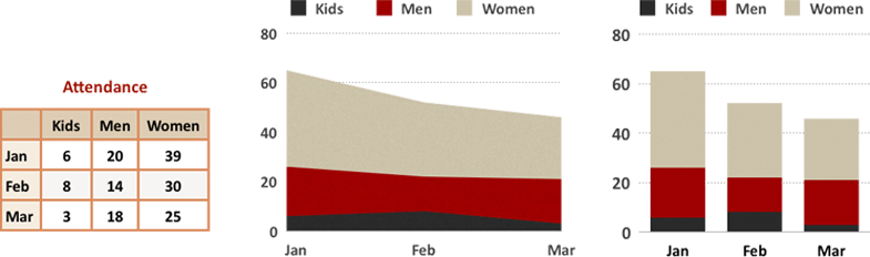
Stacked Area and Stacked Bar Charts
A stacked area chart is like a stacked column/bar chart (which is like a pie chart, despite the shape difference): it shows how much of the whole each x-axis data value represents. But this type of chart has all the interpretation problems inherent to a standard area chart, along with some issues of its own. Avoid stacked area charts unless you’re an expert. And if you are an expert, avoid it if your viewers are not. Consider a stacked column/bar chart instead.
The figure below demonstrates one of the interpretation problems with this chart type. You can see that the red band dipped down in February. However, since your eye naturally follows the top of the band, you may not consider that it’s also pinched in from the bottom, which affects your interpretation of how sharp the drop is. The stacked column chart version, however, clearly shows how narrow February’s red band is compared to the months before and after.
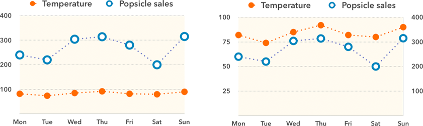
Dual-Axis Charts
A dual, or 2-axis, chart uses two y-axes, one on each side of the chart. It’s meant to compare two things that use entirely different scales on their y-axes, either because they use different units of measure (such as the weather and popsicle sales shown here) or because they span very different ranges on the same numeric scale. Here’s a wonderful treatiseon why these charts shouldn’t be used at all (except perhaps for unimportant things like popsicle sales). The main objection is that people frequently misinterpret these charts because they don’t know how to read them or have trouble comparing the two axes. So, the main rule when using a dual-axis chart is: Know Thy Audience.
At least, that’s my official advice. But I tested the figure above on several non-geek, non-math friends (a graphic designer, a German-language professor, and 16- and 11-year-old sisters), and no one had a problem understanding the dual-axis chart. While that might be a function of the small number of data points, or because I showed the original single-axis chart version for comparison, or perhaps even their innate understanding of what would happen to popsicle sales as the temperature rises, I think it indicates that you shouldn’t be automatically scared away from this chart option.
Scatter Charts
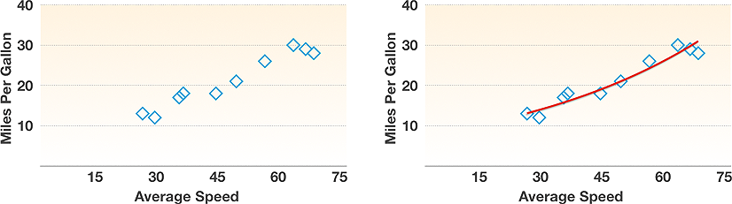
A scatter chart (also known as an x-y plot) maps pairs of coordinates to show relationships between the things being measured: rain and fungus growth rate, or a car’s average speed and its fuel consumption. In a scatter chart, instead of two series of numbers plotted along a line, the chart plots the first number from each series together, then the second-number pair, and so on; they’re great for showing clusters and outliers. It’s common practice to plot a best-fit line, or trend line, through the points on a scatter chart to emphasize a trend. But avoid trend lines unless you’re well versed in the details of what they mean: Numbers, for instance, offers six kinds of trend lines, including linear, logarithmic, and polynomial.
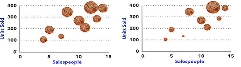
Bubble Charts
A bubble chart is basically a scatter chart whose data has an embedded third data set included. The numbers from the first two data sets are used to plot the x,y coordinates for a bubble’s center point; the third (the z value) is represented by the bubble’s size.
Bubble charts can be difficult to interpret. Is it the diameter or the area of the circle that counts? Sure, they’re mathematically intertwined, but if you don’t know which one was used for the chart, you can’t tell how much of a difference in bubble size depicts how much of a difference in the data. (My brief research into the matter says that we humans can’t help but react to the area, even if we know it’s the diameter that counts.)
You can see the big difference between the approaches in these two charts, which use the same data. The x and y coordinates show the number of salespeople and the number of various items sold. The items, however, vary in price, so the size of a bubble indicates the amount of money generated. Since the various “units” being sold have different prices, it’s the only way to include that information in the chart.
On the left, the bubble area represents the same number as the bubble diameter stands for on the right. The one on the left illustrates another problem with this chart type: two bubbles are touching, which can skew the perception of how large a number either represents—and that’s nothing compared to the interpretation problem when bubbles actually overlap.
Now that you know which chart to use when, learn how to turn your Numbers table data into charts (including nifty interactive versions of some of these chart types) in Take Control of Numbers, Third Edition.
Contents

Click for special offers to Mac Users Groups members.

Website design by Blue Heron Web Designs

Click the image for information about advertising on this website.